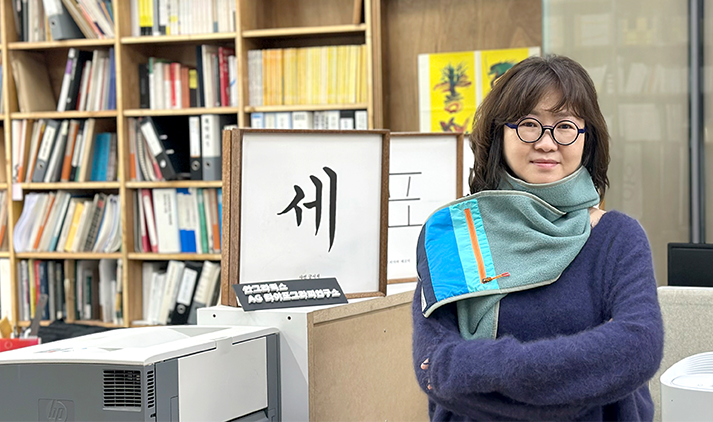
The Story Behind the New KSIF Symbol (CI): Interview with Oh Jin-kyung, CEO of Ahn Graphics
Writer홍보협력팀
Tag
2025-02-19
View37
The Story Behind the New KSIF Symbol (CI):
Interview with Oh Jin-kyung,
CEO of Ahn Graphics
The Corporate Identity (CI) and Brand Identity (BI) of the KSIF have been newly updated. What was the process behind visually redefining KSIF’s identity and vision? We spoke with Oh Jin-kyung, CEO of Ahn Graphics, the company responsible for the redesign, to learn about the meaning behind the new design and the message it aims to convey.
Hello, Ms. Oh Jin-kyung. First, could you introduce Ahn Graphics, the company that handled the redesign of
KSIF’s official symbol and typography?
Hello. Ahn Graphics is a leading graphic design company in South Korea, celebrating its 40th anniversary this
year since its establishment in 1985. The company was founded by Ahn Sang-soo, a renowned font designer,
researcher, and artist, best known for the Ahn Sang-soo typeface. Since its inception, Ahn Graphics has remained
dedicated to a philosophy centered around Hangul, continuously exploring its artistic potential and global
dissemination. Beyond typography and publishing, we collaborate with leading corporations in South Korea,
bridging digital and print media while setting new trends in visual design.
What was the background of this redesign, and what challenges did you encounter during the process?
The previous KSI logo held a unique position in terms of symbolic originality. Even when compared to other
domestic institutions or leading international organizations, it stood out in terms of aesthetic value and
distinctiveness. Creating a new identity that could surpass this was truly a challenging task. Fortunately,
early in the design process, it was decided to retain the symbol composed of Hangul consonants, which was a
relief. However, a new challenge emerged: Would simply changing the logotype while keeping the symbol intact
create a fresh impression?
The first mission of the revision was to enhance readability, ensuring that the identity could be easily
recognized by anyone. The second goal was to adjust the symbolic colors to strengthen KSIF’s presence. As a
result, rather than focusing on uniqueness or experimental design, we prioritized universality and stability in
the redesign process.
What were the key focus areas and features of the redesign?
The new logo is based on the "Seokbo Sangjeol" typeface, one of the early print styles from the time of
Hunminjeongeum’s creation, which continues the legacy of Jeongeumche (the original writing system of
Hunminjeongeum). Structurally, it retains the fundamental shapes of Hangul, while the vowels are more refined
compared to traditional Jeongeumche, making the form closer to modern Hangul and giving it a gentler impression.
Additionally, the outstanding sense of balance makes the new logotype easily readable for all age groups,
aligning with the primary mission of improving readability. Many first-time learners of Hangul are drawn to the
geometric nature of its characters, which appear to be composed of circles, triangles, and squares. We aimed to
preserve this playful and dynamic aspect in a modernized form, while refining its symmetry and balance to
enhance the KSIF’s credibility and stability.
Can you give a detailed introduction to the newly updated KSIF CI and KSI BI?
Since the establishment of KSI, its symbolic colors—gold and black—have effectively conveyed a sense of
authority and trust. For the newly revised symbol, the color scheme was redesigned to reinforce the distinct
identity and origin of "Korea." We incorporated blue and red, the representative colors of the Korean national
flag (Taegeukgi), but slightly reduced the saturation and brightness to create a more stable and sophisticated
impression that reflects KSIF’s 13-year history. The muted tones of the new symbol blend well with various
visual applications, while the strong color contrast maintains a sense of dynamism within the overall design
system.
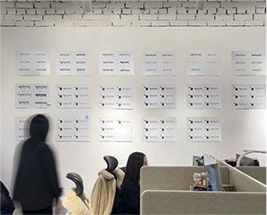
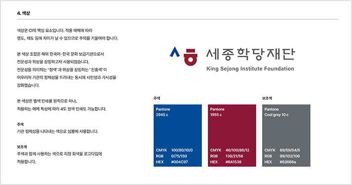 KSIF Symbol Design Guidelines – Color Explanation
Ahn Graphics is known for its design philosophy that emphasizes public accessibility and social engagement.
What was your approach and mindset while working on this project?
We were thrilled to collaborate with KSIF on this project, but at the same time, we felt an immense sense of
responsibility. In today’s world, where Hangul is gaining global recognition, taking on the symbol redesign felt
as nerve-wracking as representing Korea on an international stage. As the public face of a national institution,
the new symbol needed to achieve a world-class level of completeness while also embodying the pride and dignity
of those who learn and teach Hangul. In that sense, we viewed this project as a design language statement that
conveys confidence and prestige. This was a rare and invaluable opportunity to express Korea’s identity through
Hangul. We sincerely hope that this new symbol for KSI and KSIF will be a generous and upright emblem,
resonating with everyone who interacts with KSIF.
Lastly, what positive changes do you hope the newly updated CI and BI will bring to KSIF and KSI activities?
Do you have any final recommendations?
Now more than ever, the world’s interest in Korea is growing. I hope that through Korean language education,
which embodies the spirit and roots of Korea, KSIF and KSI will open new horizons in cultural diplomacy. I also
expect that the newly updated symbol will serve as a strong foundation, playing its role as the wings that help
KSIF and KSI soar to new heights. Thank you.