KSIF Updates Its Symbol
Writer홍보협력팀
Tag
2025-02-19
View38
KSIF Updates Its Symbol
> The official symbol, which had remained unchanged for 13 years since KSIF’s establishment in 2012, has been modified to follow the Korean writing system and apply colors that enhance readability
> The branding symbol used at KSI locations worldwide has also been adjusted to the same specifications
The King Sejong Institute Foundation (Acting President and Secretary General Bae Jong-min, hereafter referred to
as KSIF), has updated its official symbol as of January 1, 2025. Since its establishment in 2012, there have
been ongoing discussions regarding the need to improve the previous symbol, which had been in use for 13 years.
The key considerations for this revision were changing the writing style of KSIF’s name to reflect its role and
status as an institution dedicated to promoting the Korean language, as well as enhancing the color visibility
for better readability and recognition.
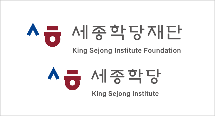
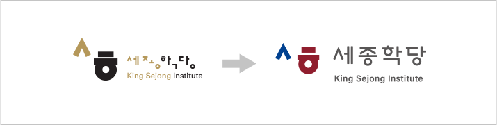
 Comparison of KSIF’s Previous and Updated Corporate Identity (CI)
KSIF’s symbol represents the expansion of the Korean language and culture worldwide through KSI. In the newly
revised symbol, the identity of the original design—which was inspired by the Korean consonants 'ㅅ' from Sejong
and 'ㅎ' from Hakdang (Institute), Hangul, and Hangeul—has been retained, while the KSIF’s name is now written in
a compact format. Additionally, the blue and crimson colors have been applied to reinforce KSIF’s
professionalism and status as an international institution dedicated to the promotion of the Korean language and
culture. Furthermore, Korean, English, and bilingual versions of the logo have been created to allow for
versatile usage in different contexts.
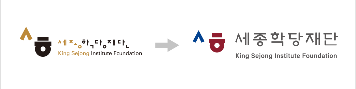
 Comparison of KSI’s Previous and Updated Brand Identity (BI)
Alongside the revision of KSIF’s official symbol, the branding symbol for King Sejong Institutes—which is used
in KSI locations worldwide—has also been updated to match the new specifications. The new KSI brand symbol will
be implemented across all King Sejong Institutes globally.